Designer Ayush Kejriwal reveals New Brand Identity to Strengthen and Solidify his Label’s Positioning

Date: 28th February 2021
Glasgow-based Indian ethnic wear designer Ayush Kejriwal, known for his unconventional ways and takes on ‘beauty’ and its derivatives launched his new logo in a series of Instagram posts and stories on Saturday, the 27th, and Sunday, the 28th of February 2021.
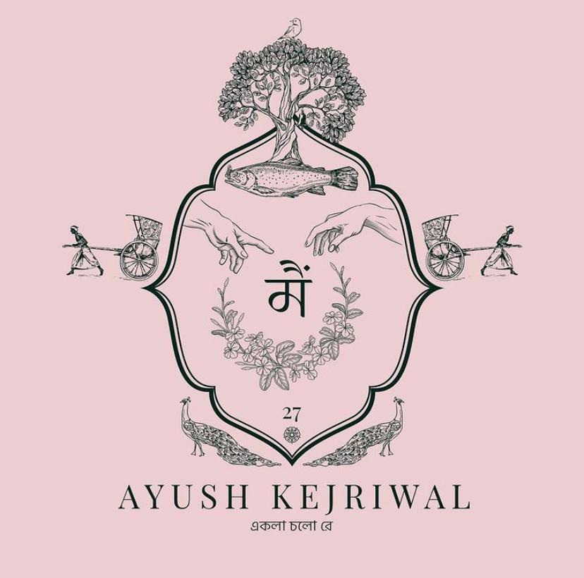
 The logo, fitting the distinctive patterns and styles of the brand, contains a multitude of elements, each symbolizing a certain imperative aspect that has played a role in culminating the brand.
The brand, Ayush Kejriwal, was launched in 2013. For 7 years, the label did not have a specific logo to call its own since the designer wanted to put together something that truly fitted the essence as well as the cultural importance of the brand.
When asked about the complexity of the logo, and the reason behind it, Kejriwal mentioned, “I am a great believer in the power of symbolism in storytelling. In the blink of an eye, a symbol can transcend language barriers and communicate complex ideas and narratives. The Ayush Kejriwal brand has evolved over the years and it is now an intrinsic part of my life story. When I reflect on the path that I’ve trodden, I see symbolism everywhere I look, and some of it is quite remarkable. My brand logo tells my story through the most potent symbols – it is all about ‘Mai’ (Me).”
The logo contains a total of approximately 7 prominent symbols, like the number 27 signifying the designer’s first residential address (27 Huntly Gardens, Glasgow) where his journey began. Some of his earlier branding witnesses the mention of the number 27, an ‘Angel Number’ according to him.
Paying respect to his adopted home (Glasgow), the logo also includes symbols that represent the life and legends of Saint Mungo – the patron saint of Glasgow. Looking closely at the logo will reveal the tree that never grew; the bird that never flew; the fish that never swam and the bell that never rang.
Not leaving out his birthplace, Kolkata, Kejriwal depicts the grit and determination of the city and its people through hand-pulled rickshaws, and the Bengali phrase একলা চলো রে (Ekla Chalo Re). Tagore’s song resonated with him in the struggles faced while building and developing his brand when certain obstacles seemed insurmountable.
Highlighting life, creativity, and new beginnings, he uses Michelangelo’s ‘Creation of Adam’ through the iconic image of two hands touching incorporated into the logo as a representation of the expressiveness and artistry involved in the design and production of his pieces. The flower motif represents universal beauty which reinforces the message that everyone is beautiful, something witnessed through the numerous campaign shoots carried out by him.
Appreciating the multifaceted nature of his brand, he uses the peacock, India’s national bird, to signify grace, opulence, and boldness, the same way he would want individuals to feel inspired to be intrepid and to wear colours with confidence regardless of the constraints placed on them by society.
Ayush, known to have worked with eye-catching and unafraid concepts, patterns, colours, and styles is a crowd favourite of several socially conscious fashion fanatics, who appreciate the singularity of a thread, as well as the abundance of an entire garment.
“A logo is so much more than just a tag or design given to a brand. It is a reflection of the cultural and value significance of what your brand stands for, and hence, I have taken my time in these 8 years to give a face to the essence of my label.”, said Ayush.


